All Products are in stock
and shipped from France.
Delivery within 48 hours.
and shipped from France.
Delivery within 48 hours.
Our categories
-
Special effect paints
- Chameleon effect paints
- Paint with an opalescent pearlescent sheen
- Prismatic Paints
- Candy Paints
- The fluorescent paints
- Phosphorescent paints
- Fluorescent paints UV
- Crystal Pearlescent Clearcoat
- Marble and crystal paint
- Paints that react to temperature
- Paints that react to light
- Magnetic paint and rust color
- Chrome effects
-
Our paint ranges for bodywork
-
PAINT KIT FOR CAR BODYWORK
-
CAR COLOUR CODE
- AIXAM car paint
- ALFA ROMEO car paint
- ASTON MARTIN car paint
- AUDI car paint
- BMC car paint
- BMW car paint
- BUGATTI car paint
- CADILLAC car paint
- CHEVROLET car paint
- CHRYSLER car paint
- CITROEN car paint
- DACIA car paint
- DAEWOO car paint
- DAIHATSU car paint
- DODGE car paint
- FERRARI car paint
- FIAT car paint
- FORD car paint
- GENERAL MOTORS car paint
- HONDA car paint
- HYUNDAI car paint
- ISUZU car paint
- IVECO car paint
- JAGUAR car paint
- JEEP car paint
- KIA car paint
- LADA car paint
- LAMBORGHINI car paint
- LANCIA car paint
- LAND ROVER car paint
- LEXUS car paint
- Lotus car paint
- MASERATI car paint
- MAZDA car paint
- MERCEDES car paint
- MG car paint
- MINI car paint
- MITSUBISHI car paint
- NISSAN car paint
- OPEL car paint
- PEUGEOT car paint
- PORSCHE car paint
- RENAULT car paint
- Rolls Royce car paint
- ROVER car paint
- Saab car paint
- SEAT car paint
- SKODA car paint
- SMART car paint
- SSANGYONG car paint
- SUBARU car paint
- SUZUKI car paint
- TOYOTA car paint
- Volkswagen car paint
- VOLVO car paint
- Primers for car paints
- Epoxy-polyester paint for wheel rim
- Spraypaint bodywork
- Metallic effect paints for car bodywork
- Tuning paints with effects
- Pearlescent paints for bodywork
- Solvent-based 1K base coats for cars
- 2K paints for cars
- Vintage cars paints
- Rustproof car frame paints
- Car underbodies and pick-up trucks paints
- Car cylinder block paints
- Dashboard paints
- Car brake paints
- Plastic bumper paints
- Car wing mirror paints
-
CAR COLOUR CODE
-
PAINT KIT FOR MOTORCYCLE BODYWORK
-
Motorcycle and scooter paint code - Can or spray paint
- APRILIA motorcycle paint
- BENELLI motorcycle paint
- BIMOTA motorcycle paint
- BMW motorcycle paint
- Buell motorcycle paint
- CAGIVA motorcycle paint
- DERBI motorcycle paint
- DUCATI motorcycle paint
- GILERA motorcycle paint
- HARLEY-DAVIDSON motorcycle paint
- HONDA motorcycle paint
- HUSQVARNA motorcycle paint
- INDIAN MOTORCYCLE PAINT
- KAWASAKI motorcycle paint
- KTM motorcycle paint
- KYMCO motorcycle paint
- LAMBRETTA motorcycle paint
- MALAGUTI motorcycle paint
- MBK motorcycle paint
- MORINI motorcycle paint
- GUZZI motorcycle paint
- MV AGUSTA motorcycle paint
- PEUGEOT motorcycle and scooter paint
- PIAGGIO motorcycle paint
- SACHS motorcycle paint
- SUZUKI motorcycle paint
- SYM motorcycle paint
- TRIUMPH motorcycle paint
- YAMAHA motorcycle paint
- Motorcycle tuning paints
- Motorcycle paint primers
- Motorcycle spray paints
- Epoxy paints for motorcycle frames
- Epoxy paints for motorcycle rims
- Metallic motorcycle paints
- Pearly motorcycle paints
- Motorcycle clearcoats
- The paints for plastic of cross country motorcycle
- Jet ski hull paints
- Paints for Quad
-
Motorcycle and scooter paint code - Can or spray paint
- Scooter fairing paints
- Helmet paints
- Auxiliary products
- Bicycle paints - Stardust Bike
- RAL Paint - Pantone Code
-
PAINT KIT FOR CAR BODYWORK
- Finish paints and topcoats
-
Artistic and custom specialties
- EPOXY RESINS
- Gilding with a gold leaf
- Pinstriping paint and brushes
- Hydrographic Film
- Covering car and motorcycle
- Pearls and Flakes bodywork
- Painting over the body
- Paint for fishing decoys
- Paints for guitars
- HIKARI : paints for models and miniatures
- Acrylic 3D Printing Paint – Primers, Colors, and Clearcoat
-
Bodywork accessories and consumables
- HVLP Spray Guns for car and motorcycle paints
- Our ranges of airbrushes
- Compressed air connections
- BODYWORK ACCESSORIES
- Abrasives for bodywork
- Buffing and polishing of bodywork
- Protective Equipment for painters
- POSTERS
- Paint air filters
- sample supports for paint tests
- Infrared and ultraviolet drying lamps for paint
- Bodywork adhesives and paint
- Air compressors for painting
- Paints for airbrush
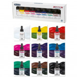
The 36 standard colors Aero Color by Schmincke 28ml
New product
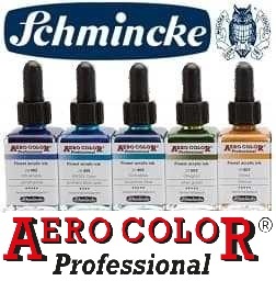
Professional AERO COLOR paints
The finest acrylic ink for airbrushes
36 colors to choose from in stock
Color chart and instruction at the bottom of the page
The Standard Colors of the AERO COLOR Professional range developed by Schminke are known in the world of artists and airbrush specialists as the "Rolls Royce of airbrush paints".
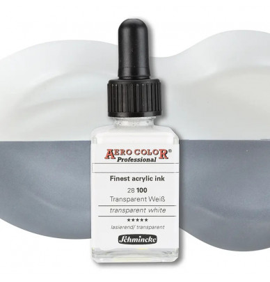
Aero Color ink is the finest acrylic ink, delivered in a 28 ml glass bottle with a pipette cap for precise drop-by-drop dosing.
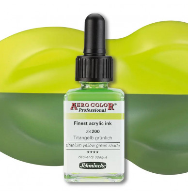
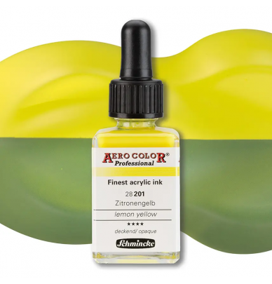
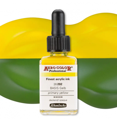
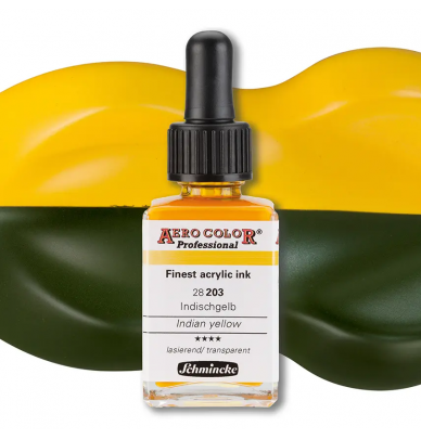
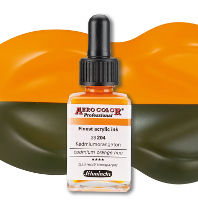
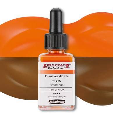
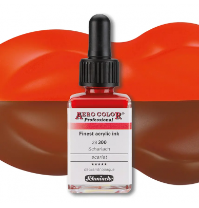
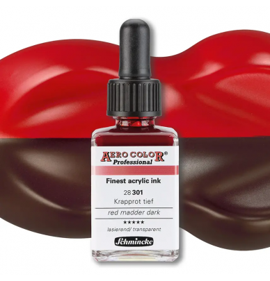
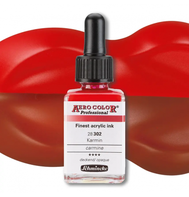
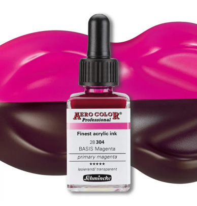
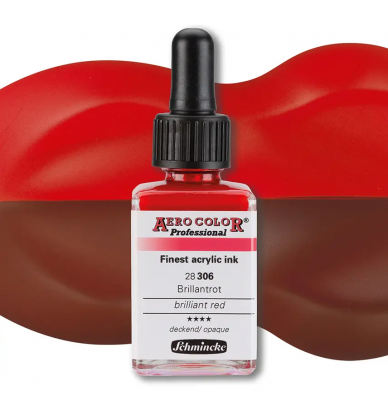
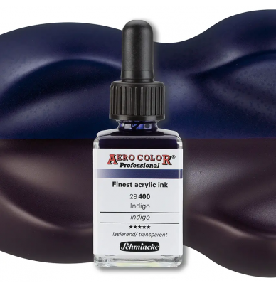
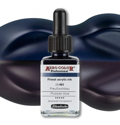
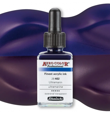
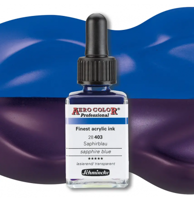
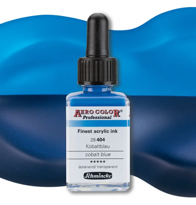
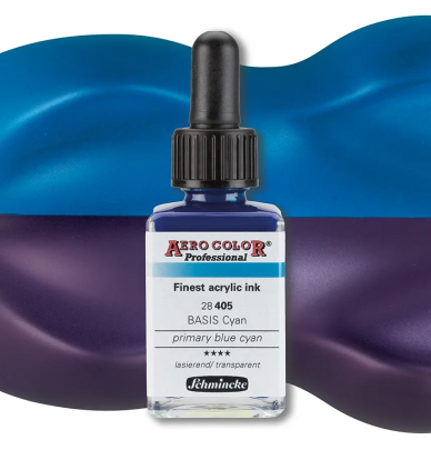
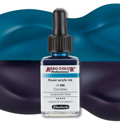
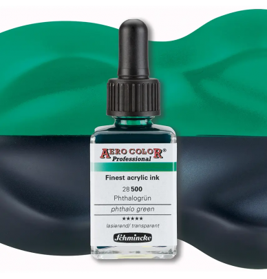
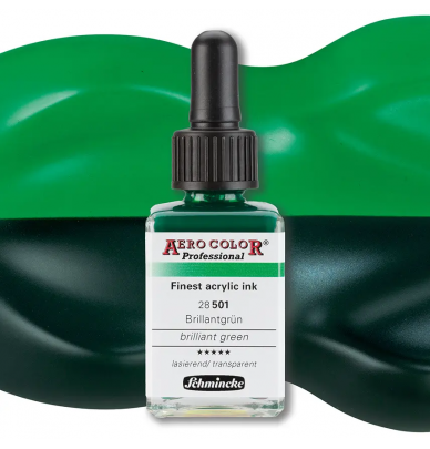
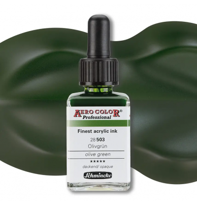
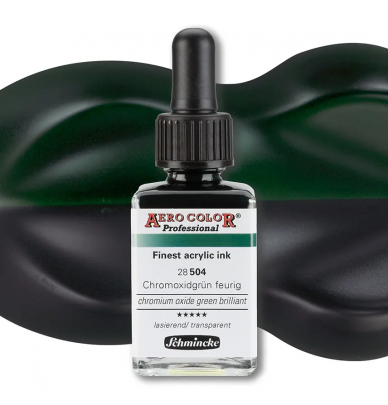
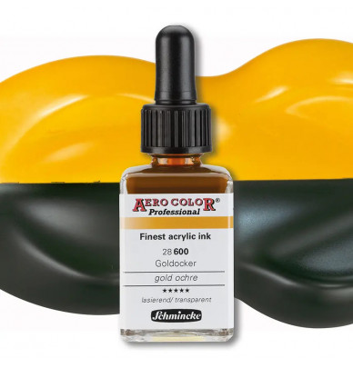
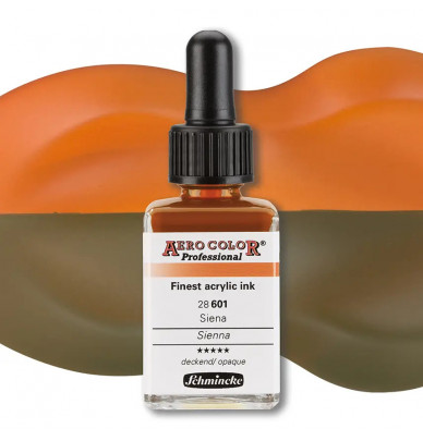
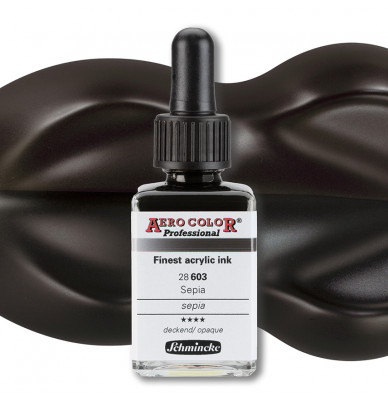
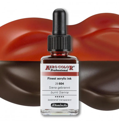
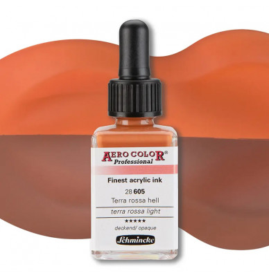
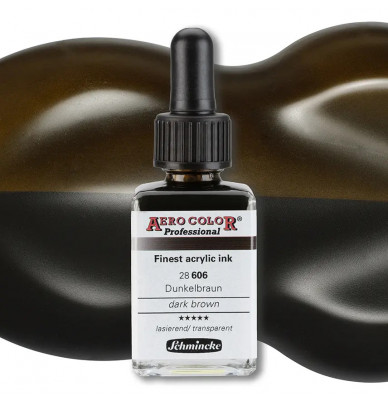
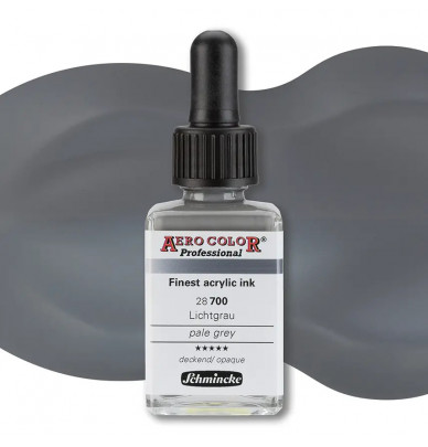
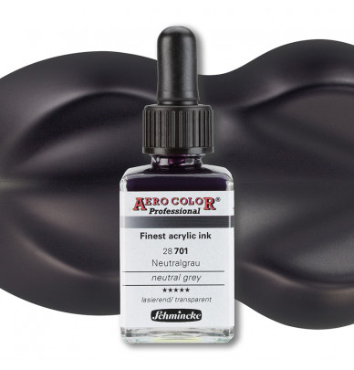
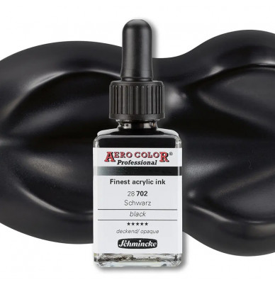
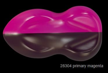
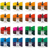
The downloadable AERO COLOR® Professional color chart at the bottom of the page shows the intensity and covering power of each color, on Speedshapes. You can see the different results on black and white backgrounds, because the inks in the Standard range have different degrees of opacity.
The Candy Aero Color range has completely transparent colors.
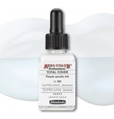
One finds the totally opaque colors in the Total Cover Aero Color range (because they cover completely).
Antique Color Palette
These ranges of liquid inks, decline the pure historical colors of the Fine Arts, produced since antiquity with pure mineral pigments. The tradition of these sublime artistic colors is perpetuated, with modern pigments obtained by synthesis, micronized and ultra-resistant to light.

Hiding power and concentration :
A few drops of Schmincke Ink covers a surprisingly large area.
Characteristics and use
Extra fine acrylic ink for airbrushes
Also suitable for pencils, liners, and brushes.
Maximum pigmentation
Maximum UV resistance
Ink dilutable with water
Waterproof when dry
Cleaning with soapy water.
Application :
Shake well before use
Use with nozzle 0.15 mm or larger
Application on paper, canvas, all types of finishes
Can be overcoated with mediums or water-based varnish or solvent-based bodywork topcoats.
The AERO COLOR Professional color chart is available for download at the bottom of the page.
The use of AERO COLOR inks is widespread, as they are not exclusively reserved for artistic drawing : their total resistance to UV rays and their very high yield, as well as their perfectly waterproof properties, allow them to be used in the world of model making.
Painting RAL model shades with Schmincke airbrush paint range :
By downloading the PDF recipe table, all RAL shades can be countertyped, thanks to simple formulas (one part = one drop), developed by an artist.
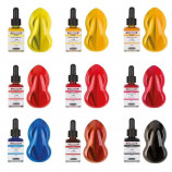
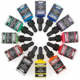
Here is the list of the 36 Standard colors
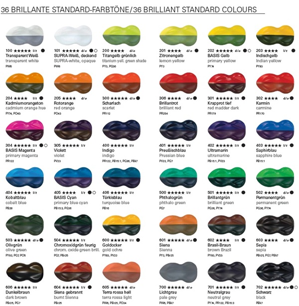
Semi-transparent colors
The Standard series brings together the classic and main colors, which can be found in the painter's usual palette.
The colors are variably opaque or transparent, depending on the nature of the pigment. You can see the degree of semi-opacity of each color by consulting the color chart applied on Speedhsapes with either a white background (top) or a black background (bottom).
In the other series of the AERO COLOR range, the colors are totally opaque (Total Cover) and totally transparent (Candy).
Primary colors, the mixing of tints to create colors :
The variations and mixing possibilities of the shades are infinite, for airbrush and liquid acrylic techniques.
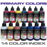
It is said that all colors can be created with the three primary colors (Magenta 28304, blue Cyan 28405, Yellow 28202).
In truth, some colors can never be obtained with these 3 primaries, for example : a bright orange, some blues, ... That's why some reds like Carmine, scarlet red, or some blues, like Prussian Blue, or ultramarine are obtained thanks to particular and pure pigments.
It is necessary to add white to lighten, and black to darken (many painters will react on this statement, because one should never use black to darken a color, or a shadow ... The shadow is created with blue for example.
To create a natural foliage, darken, make alive and deep, we will use a mixture of green, red, and a touch of purple, and avoid black.
22 other products in the same category
WE ALSO RECOMMEND YOU
- Special Effect Paints
- Chrome Effect
-
Car and motorcycle paint
-
CAR COLOUR CODE
- AIXAM car paint
- ALFA ROMEO car paint
- ASTON MARTIN car paint
- AUDI car paint
- BMC car paint
- BMW car paint
- BUGATTI car paint
- CADILLAC car paint
- CHEVROLET car paint
- CHRYSLER car paint
- CITROEN car paint
- DACIA car paint
- DAEWOO car paint
- DAIHATSU car paint
- DODGE car paint
- FERRARI car paint
- FIAT car paint
- FORD car paint
- GENERAL MOTORS car paint
- HONDA car paint
- HYUNDAI car paint
- ISUZU car paint
- IVECO car paint
- JAGUAR car paint
- JEEP car paint
- KIA car paint
- LADA car paint
- LAMBORGHINI car paint
- LANCIA car paint
- LAND ROVER car paint
- LEXUS car paint
- Lotus car paint
- MASERATI car paint
- MAZDA car paint
- MERCEDES car paint
- MG car paint
- MINI car paint
- MITSUBISHI car paint
- NISSAN car paint
- OPEL car paint
- PEUGEOT car paint
- PORSCHE car paint
- RENAULT car paint
- Rolls Royce car paint
- ROVER car paint
- Saab car paint
- SEAT car paint
- SKODA car paint
- SMART car paint
- SSANGYONG car paint
- SUBARU car paint
- SUZUKI car paint
- TOYOTA car paint
- Volkswagen car paint
- VOLVO car paint
.
.
.
-
MOTO COLOUR CODE
- APRILIA motorcycle paint
- BENELLI motorcycle paint
- BIMOTA motorcycle paint
- BMW motorcycle paint
- Buell motorcycle paint
- CAGIVA motorcycle paint
- DERBI motorcycle paint
- DUCATI motorcycle paint
- GILERA motorcycle paint
- HARLEY-DAVIDSON motorcycle paint
- HONDA motorcycle paint
- HUSQVARNA motorcycle paint
- INDIAN MOTORCYCLE PAINT
- KAWASAKI motorcycle paint
- KTM motorcycle paint
- KYMCO motorcycle paint
- LAMBRETTA motorcycle paint
- MALAGUTI motorcycle paint
- MBK motorcycle paint
- MORINI motorcycle paint
- GUZZI motorcycle paint
- MV AGUSTA motorcycle paint
- PEUGEOT motorcycle and scooter paint
- PIAGGIO motorcycle paint
- SACHS motorcycle paint
- SUZUKI motorcycle paint
- SYM motorcycle paint
- TRIUMPH motorcycle paint
- YAMAHA motorcycle paint
.
.
-
CAR COLOUR CODE
- Finish Paints and Topcoats
-
Specialties
-
Accessories and consumables
.
.
- AIRBRUSH PAINT
- COLORCHART
